IAA 2026: these brands got it. The rest got stuck on specs.

During my visit to IAA Transportation 2026 in Hannover, I paid particular attention to the marketing and branding of the manufacturers exhibiting there. How do they present their innovations? What stories do they tell? And how do they turn complex engineering into something visitors can understand and remember?
What stood out was the difference between brands with a clear story and brands trying to show as much as possible. The strongest stands brought the product, presentation and customer promise together. They demonstrated just how much clear positioning can contribute to your presence at a trade show.
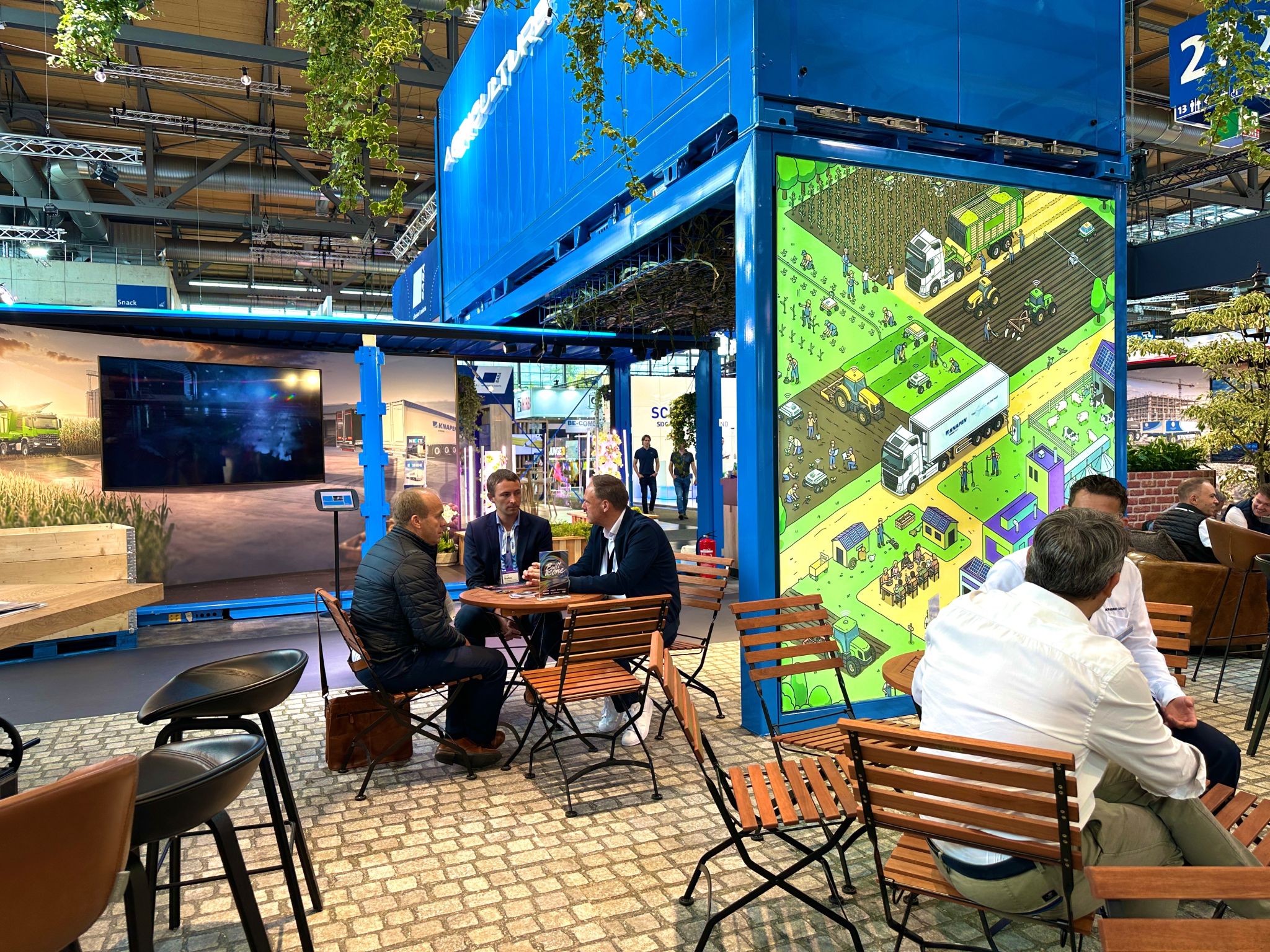
More brands are turning their stands into experiences. Ford’s “Uptime Road” and Krone’s “Built as one” were good examples. They offered visitors an environment to explore, with interactive elements encouraging them to stay longer and experience things for themselves. For me, the strength of this approach lies in its connection to the brand story. An interactive experience should reveal something about your product, your services or your customer’s world. That gives the experience meaning and visitors something to remember your brand by. Simply adding another screen or a fun activity is not enough.
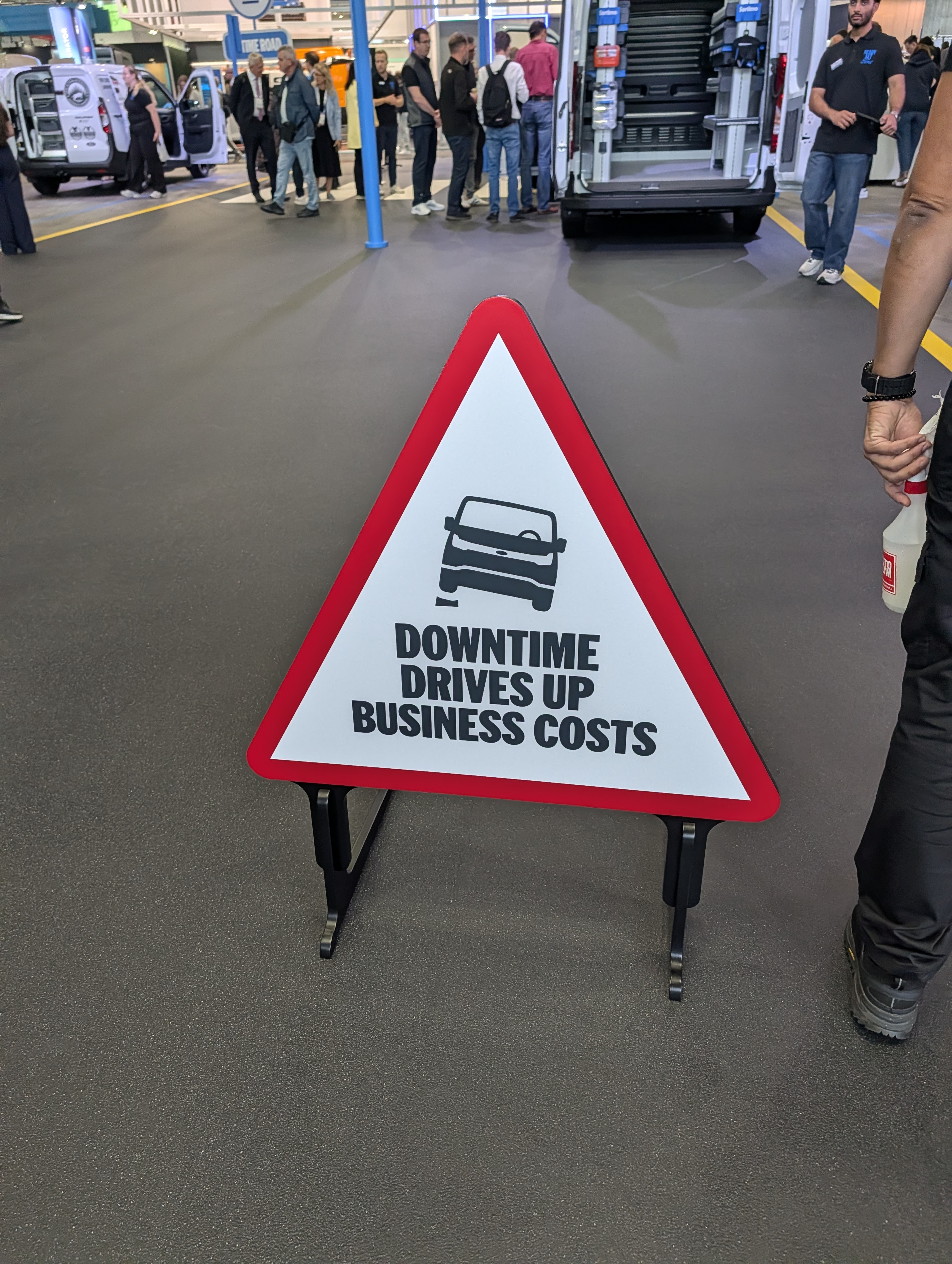
At Ford, the uptime theme addresses a recognisable need: commercial vehicles must be available to get the job done. Its product and service introductions supported that message. Ford Pro presented new versions of the electric Transit City and introduced Uptime Services and Uptime Insights in Germany, aimed at preventing downtime and improving maintenance planning. Vehicles, software and service all became part of the same customer promise.
Thermo King was another strong example. With “MAX YOUR COOL”, the brand had a distinctive theme that ran consistently through its stand, videos and visuals. The message extended across the entire funnel, from attracting attention to presenting solutions and service.This is exactly where a strong creative concept adds value. It brings consistency to everything you communicate. At Thermo King, visitors encountered the same story throughout, with an appropriate execution at each stage. The content helped make that story engaging and easy to understand. That is how a theme becomes much more than a large headline above a stand.
JOST also showed how to make a broad, technical product portfolio accessible. An interactive screen presented a world viewed from above, featuring four application areas: transport, city, construction and mining. Selecting an area zoomed you in on the group’s solutions within that environment. Within mining, for example, you could explore special transport, truck & pushout trailer, road train, autonomous and super heavy duty. From those applications, you could move on to specific products and eventually their details, such as the specifications and functions of trailer landing gear. I thought this structure worked well. You start with a recognisable working environment and discover the relevant solutions step by step. The technical depth is still there, but first it gets context. That makes the screen useful both for visitors exploring their options and specialists wanting to understand exactly how a component works. It also gives the sales team a logical route through the conversation.
At SAF-Holland, I saw how an interactive screen can add very little. Screens alongside various products and axles let you view a 3D model and three slides. The same bullet points and specifications kept appearing. For me, this offered barely any additional value over a specification sheet or brochure. The presentation was digital, but it did not help me better understand the product’s application or benefits. The main difference from JOST was how the story was structured. At JOST, you started with a recognisable industry and discovered relevant products through specific applications. On the SAF-Holland screens I looked at, the focus stayed on the product and its features. You could click through, but gained little additional insight.
That is an important lesson for brands investing in interactive content. Interaction needs to give the visitor something of value. That might mean understanding how a component works, which version suits a particular application or what a technical choice means in practice. A 3D model can be excellent for this if it shows something that would otherwise be difficult to explain. Without that purpose, it is mostly an expensive way to present a list of specifications.
I also saw plenty of stands where very few choices seemed to have been made. Large amounts of text, world maps, product displays and messages competed for attention. It felt as though every department had been allowed to add something, without anyone ultimately deciding what visitors should remember. The desire to be comprehensive is understandable. A great deal has been invested in products and development, and everyone wants to demonstrate their expertise. Yet on the exhibition floor, that completeness often creates noise. Visitors are left to work out what matters, who the offering is for and why it is relevant. A strong stand therefore starts before the design process. It begins with a clear brand story, a specific target audience and a focused value proposition. Which customer challenge are you addressing? What promise are you making? And what makes that promise credible? This foundation helps you decide which products, visuals and messages actually deserve space.
The Stand should support the sales team, not the other way around.
A salesperson should be able to build on what a visitor has already seen and understood. A clear demonstration or a familiar real-world scenario provides a natural opening for a conversation. If the salesperson first has to connect all the separate messages, the stand has not done its job properly. I was also struck by how many interchangeable taglines and messages were on display. Think “Experience more value”, “You need it”, “Sustainable innovation” and “We think transport”. These phrases sound positive at first, but do very little to explain why someone should choose that particular brand. More value, innovation and sustainability: almost any company can claim them. Without specifics, they remain empty statements. What value do you mean? For whom? And what can you demonstrate that you do differently or better?
A simple test is to replace the logo above a message with a competitor’s. If the wording still fits perfectly, it probably does little to distinguish your brand. A tagline does not have to explain your entire value proposition, but it should add something distinctive. I felt “MAX YOUR COOL” was more successful in that respect: it has a clear connection to the product category and provides room for a recognisable creative execution.
Another striking observation was how little clearly identifiable AI-generated content I came across. With technical products, I can understand that caution. A generated image can look convincing while getting details of a vehicle, structure or mechanism wrong. In manufacturing, those details are part of your credibility. At VETH, I saw a product film made entirely with AI, accompanied by the disclaimer: “AI generated content may vary from base model”. I appreciate that transparency. At the same time, I was left wondering whether the film did the product justice. When you use visuals to demonstrate engineering quality, you want visitors to trust what they are seeing. The disclaimer acknowledges possible discrepancies, but does not remove that tension. For me, that is the risk: AI-generated content can feel like a cheap shortcut to having moving images. The relevant question is what those images contribute to your story and how accurate they need to be to serve that purpose. At Krone, I saw an application that worked well. AI-generated environments extended visually from the screens into the stand design. The screen content and physical surroundings became one coherent experience. AI had a clear creative purpose here: enriching the world around the product and bringing the stand experience together.
A broader theme ran through all these observations: many brands communicate primarily from the perspective of their own engineering. Specifications and features get plenty of attention, while their significance for the customer sometimes remains unclear. Technical performance matters, of course. Total cost of ownership deserves attention too. But terms such as “efficient”, “reliable” and “low TCO” only become convincing when you make them concrete. What difference does it make to a planner? Which task becomes easier for a driver? How does your solution help a business owner deliver on commitments to customers? If the product itself offers few unique points of difference, the wider offering deserves more attention. Think parts availability, accessible support, suitable maintenance agreements and knowledge of specific applications. These can also give customers a compelling reason to choose your brand, provided you can back up the promise.
For manufacturers, a better trade show presence therefore starts with a clear decision: what should customers be able to tell others about us after their visit? Let that answer guide the stand, the content, the launches and the sales conversation. That is how your brand story becomes something visitors can actually experience.